A year of onboarding experiments
In my time as a Growth designer at Mural, I focused a lot on how to get new users to their "aha!" moment. While not all these experiments were successful from a numbers perspective, I was able to synthesize these experiment learnings into what we should and shouldn't do as well as start a bluesky on continued strategy.
Metrics: Onboarding completion • Retention rate • Increased frequency of use in product
Team: Product Designer (me) • PM • EM • Tech Lead • Developers (3-6) • (Product Analyst • Content Designer, Motion Designer, User Researcher)
The problem 😬
At a high level, we saw a low retention rate for new users. This meant that while we had a healthy number of people signing up for an account, the funnel of monthly active members (MAMs) got increasingly small.
When considering Growth, everything is connected. We had a low number of people completing the onboarding, which meant there was lower engagement, which meant lower retention. The question becomes: which lever should we pull?
Experiment: Jumping into Mural
Hypothesis: People are more likely to opt into onboarding when they feel like the onboarding is fast.
Metric: Number of people opting into onboarding
After signing up for an account, there was a dropoff in the number of people who were opting into the onboarding. Working with the Product Analytics team, we knew that onboarding completion correlated with a higher retention rate.
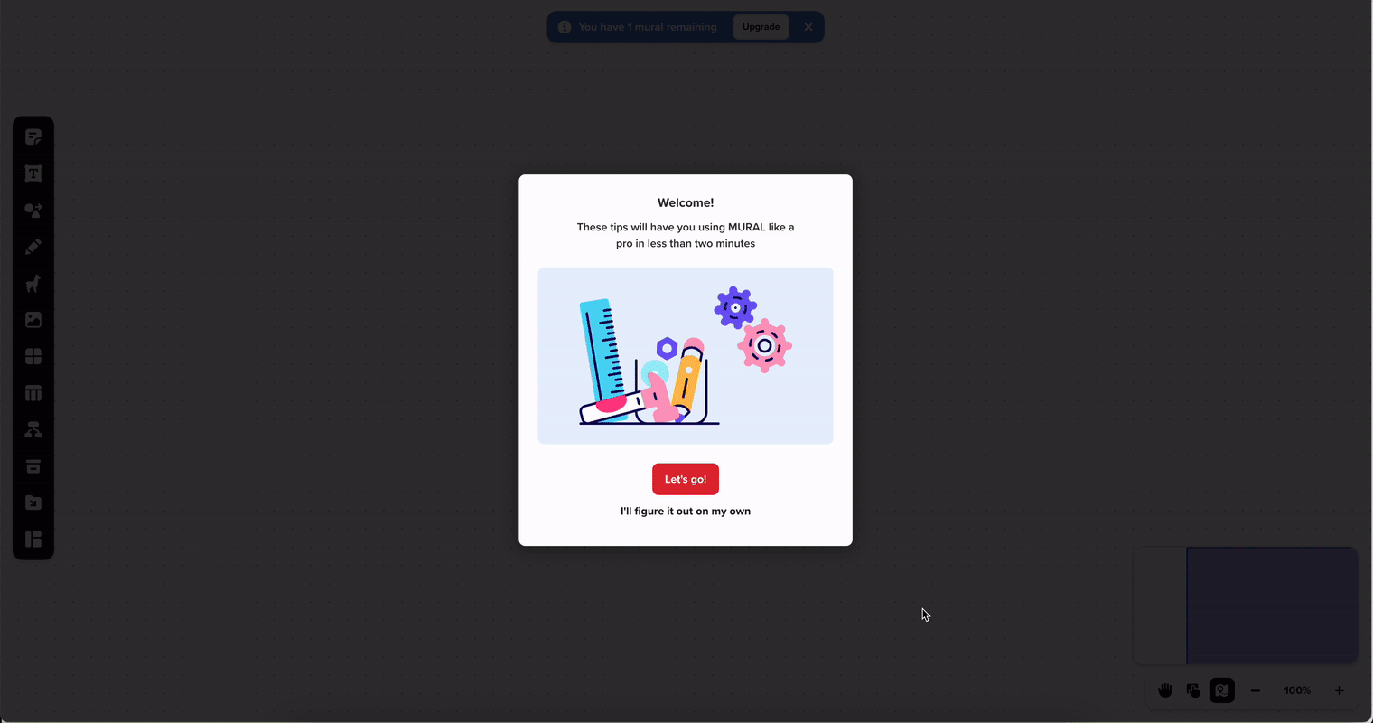
While the sign-up flow was pretty standard, we noticed this screen seemed like a potential extra step. So we sought to make a slight adjustment.
OLD This page told the users what they would learn through onboarding. Through user testing, we saw that users tended to skip over that section and the most interesting part to them was that it took under two minutes to complete.
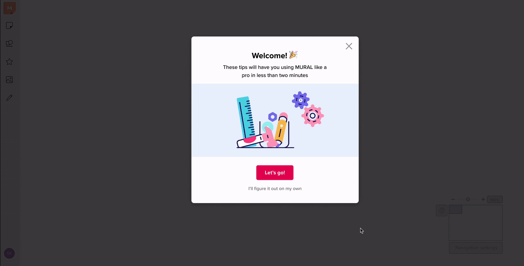
NEW This new design used a modal over a scrim to make it seem like they landed in the product earlier.
I also worked with a Content Designer to get rid of the extraneous information so the user can focus on how fast they would be able to complete it.
The final flow did not have any fewer steps than the previous flow
Results
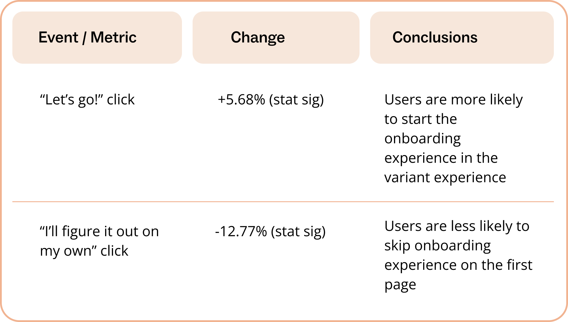
We saw a statistically significant improvement of +5.68% of people opting into onboarding.
Experiment: The Value of Mural
Hypothesis: By showing the value of Mural in the onboarding, people are more likely to reach their 'aha!' moment and continue to use the product after initial sign up.
Metric: Number of new users completing onboarding
Onboarding was a lever we tried pulling quite often to help users reach that 'aha!' moment because it was one of their first experiences with the product. Going through the old onboarding, users often said "That was easy" but then proceeded to the main product to ask "How do I tie this to my job?".
In this experiment, we tried an exercise that didn't just teach the users the basics, but demonstrated how to use those basics in a framework.
In the existing onboarding, we teach the user the basics: How to add a sticky, move around, and zoom in/out.
Research & testing
To determine how to show the value of Mural, I asked internally when people had their 'aha!' moment with the product. The two themes that came up were: 1) When they saw all of the people working in real time on the screen and 2) When they utilized a template effectively for the first time.
I sketched some ideas and worked with the Motion Designer to figure do some A/B user testing to see which one to refine.
OPTION A involved working with other 'people' in real time. By giving the new users a specific prompt, they would be able to not just learn how to add stickies, but synthesize, learn about time boxing, and voting.
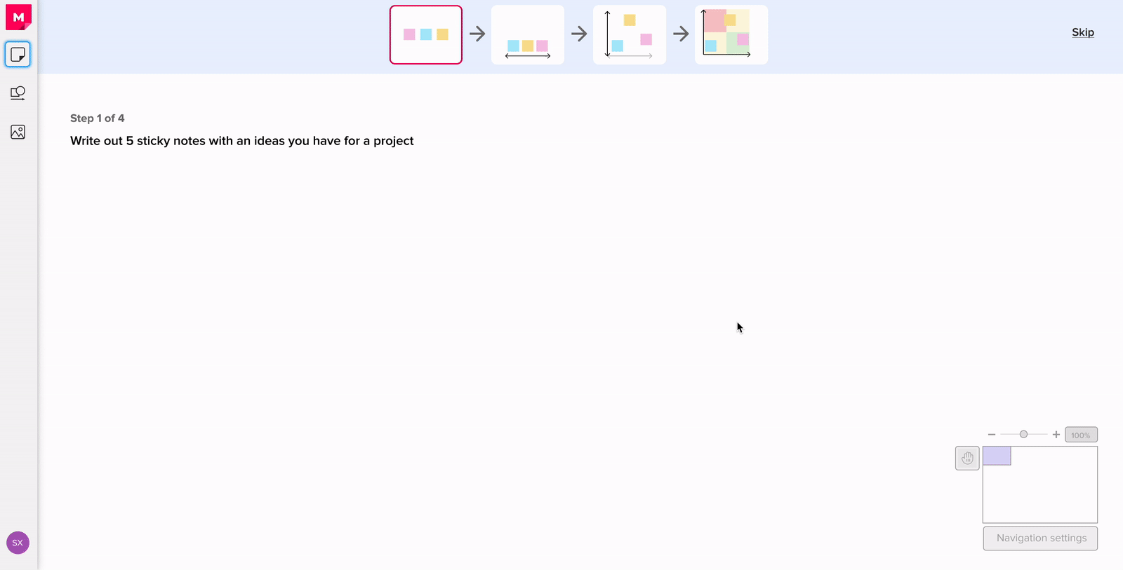
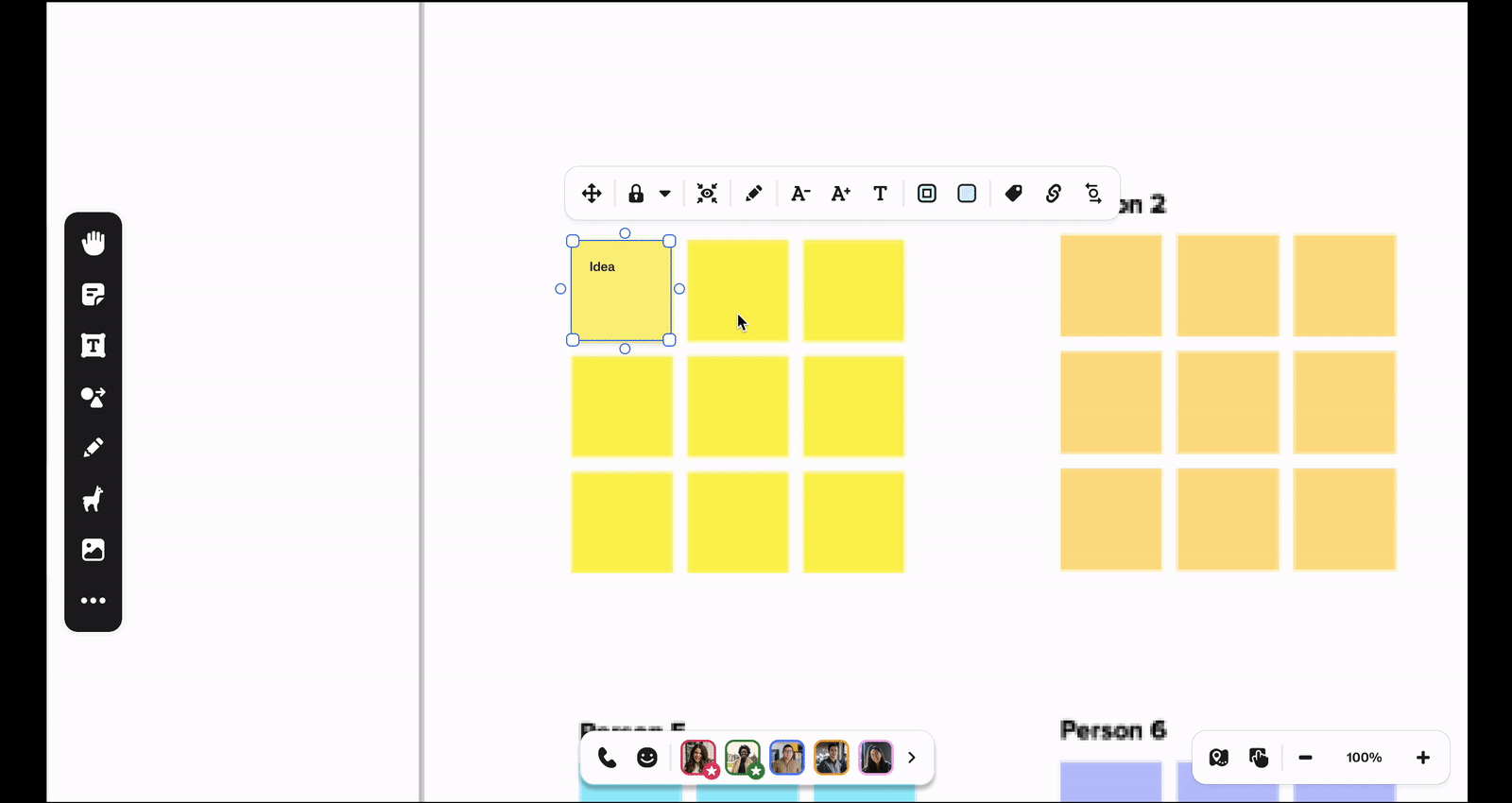
OPTION B utilized a four quadrant matrix framework to help users learn how to add stickies and prioritize projects.
I ended up going with Option B. Through user testing, I found that while people who preferred Option A were also ok with option to Option B, the inverse was not true. People who preferred Option B were more like our first-time Creators and felt that Option A did not provide enough structure or next steps, whereas Option B was a clear artifact they could use to present their supportive reasoning.
Since the people who preferred Option B had similar characteristics to our first-time Creators, it also felt like a better Growth method to focus on them, since they would have a higher chance of having higher chances of virality. After talking with engineering, it was also quoted to be a little easier to implement from a technical side.
Results
This experiment did very poorly from a numbers perspective. We saw a stat sig drop of -95.54% in onboarding completion. It was a huge learning for us on what we shouldn't do.
Experiment: Facilitator-triggered onboarding
Hypothesis: Helping facilitators onboard new users is a more effective way of encouraging people to do onboarding than opting in themselves.
Metric: Number of new users completing onboarding • Repeat usage by facilitators
From the User Research team, we heard that facilitators often struggled with onboarding new users during a session. While all of the new joiners were given an opportunity to opt into onboarding, very few did. This forced the facilitators to pause their session to onboard new users, which would detract from the bigger goal of the session.
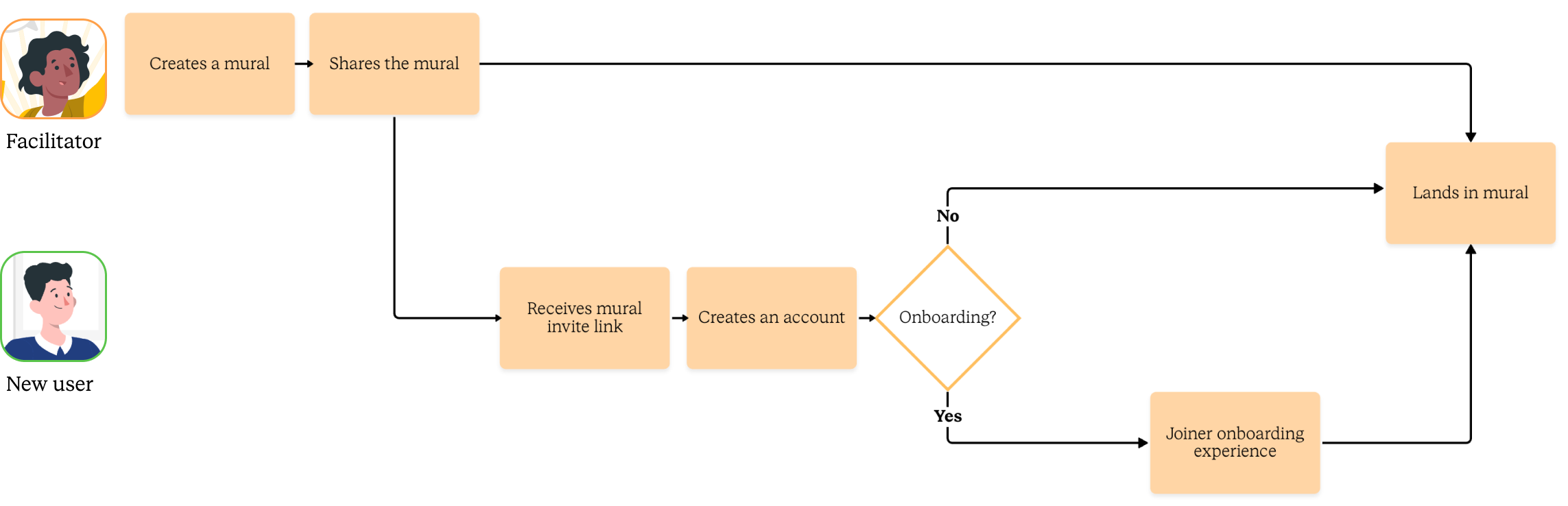
By the end, only 7% of new users finished an onboarding session
the big questions
As we explored the solutions, there were some consistent questions that came up.
1. Is there a way to back this up quantitatively?
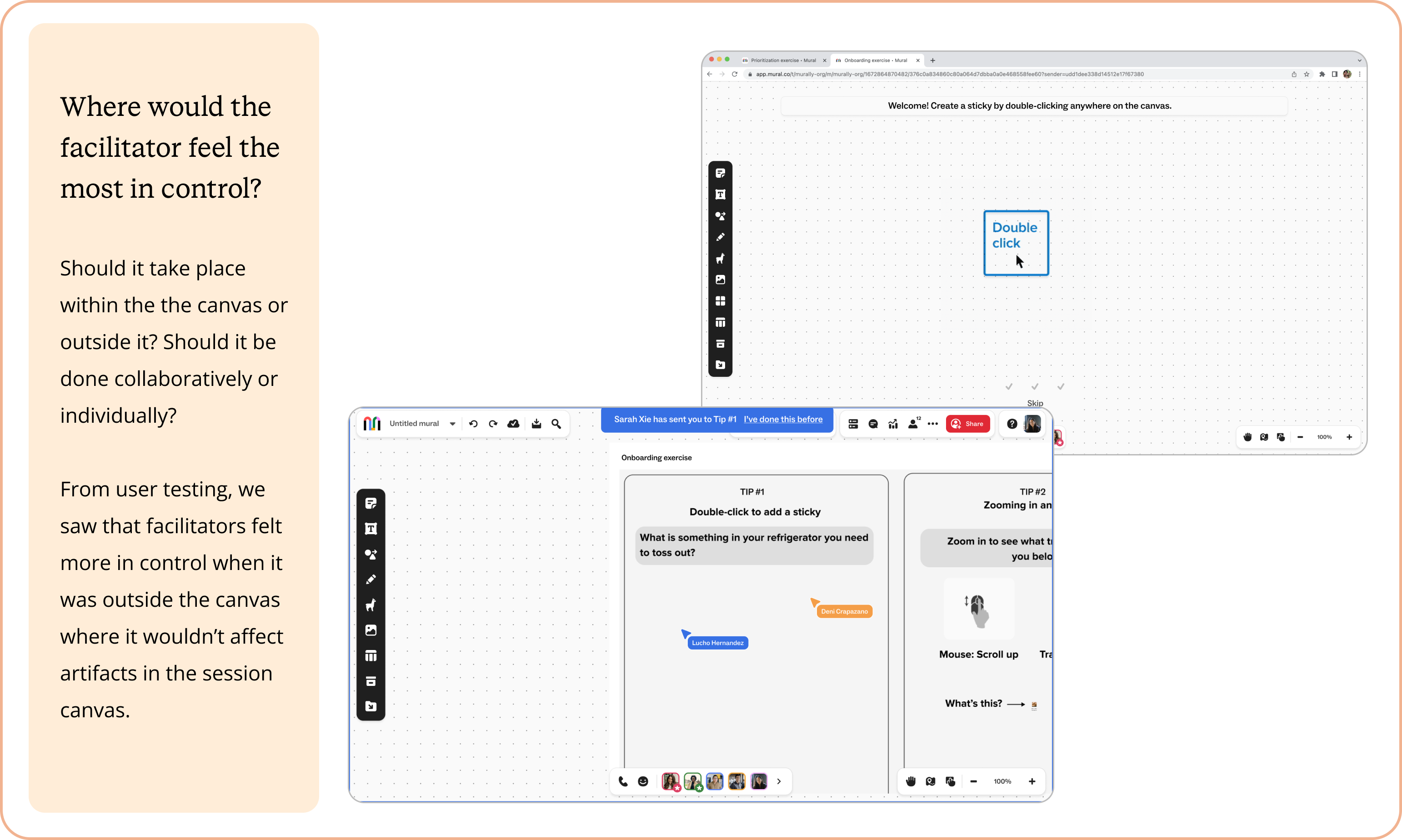
2. Where should this feature live? How would the faciliatator feel the most in control?
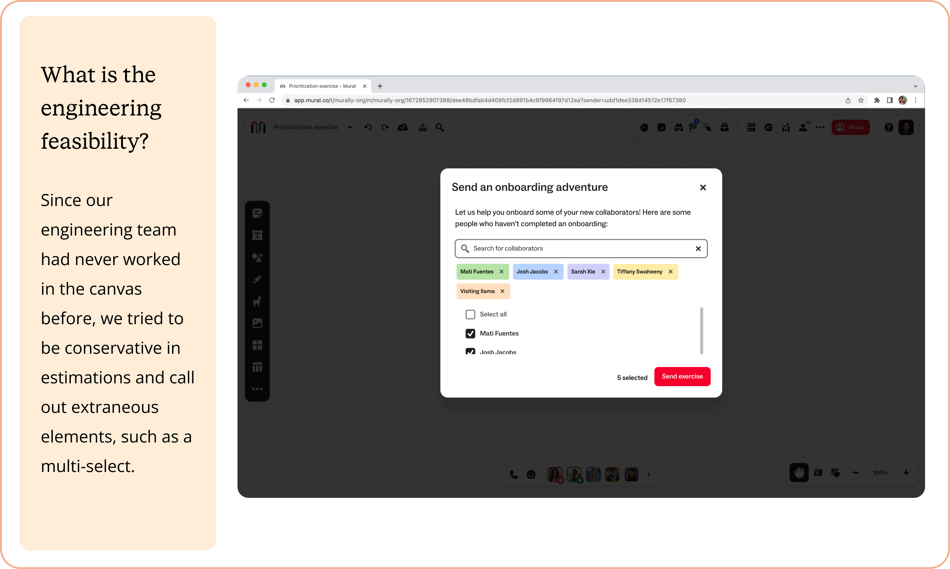
3. What is the engineering feasibility?
This is how we answered them:
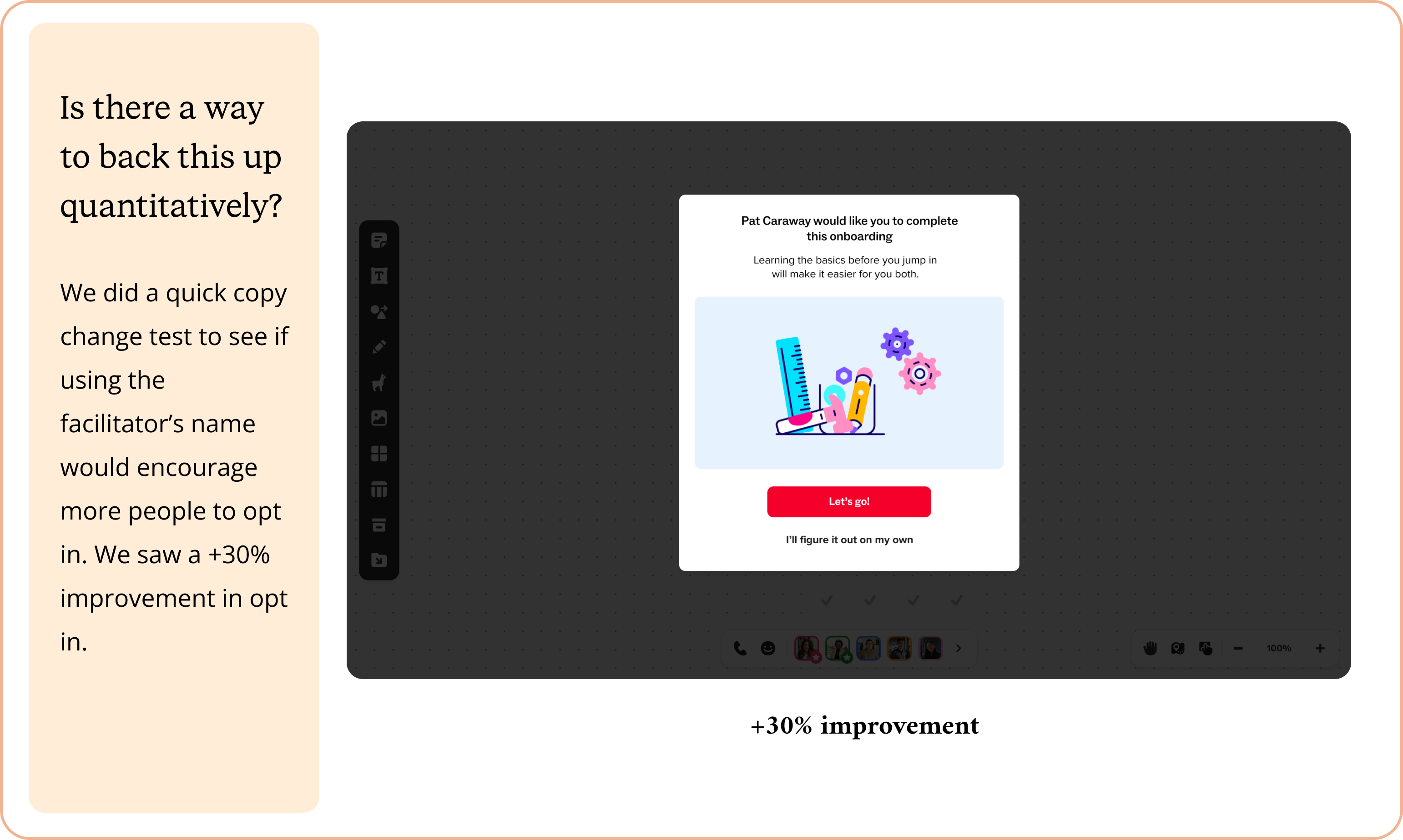
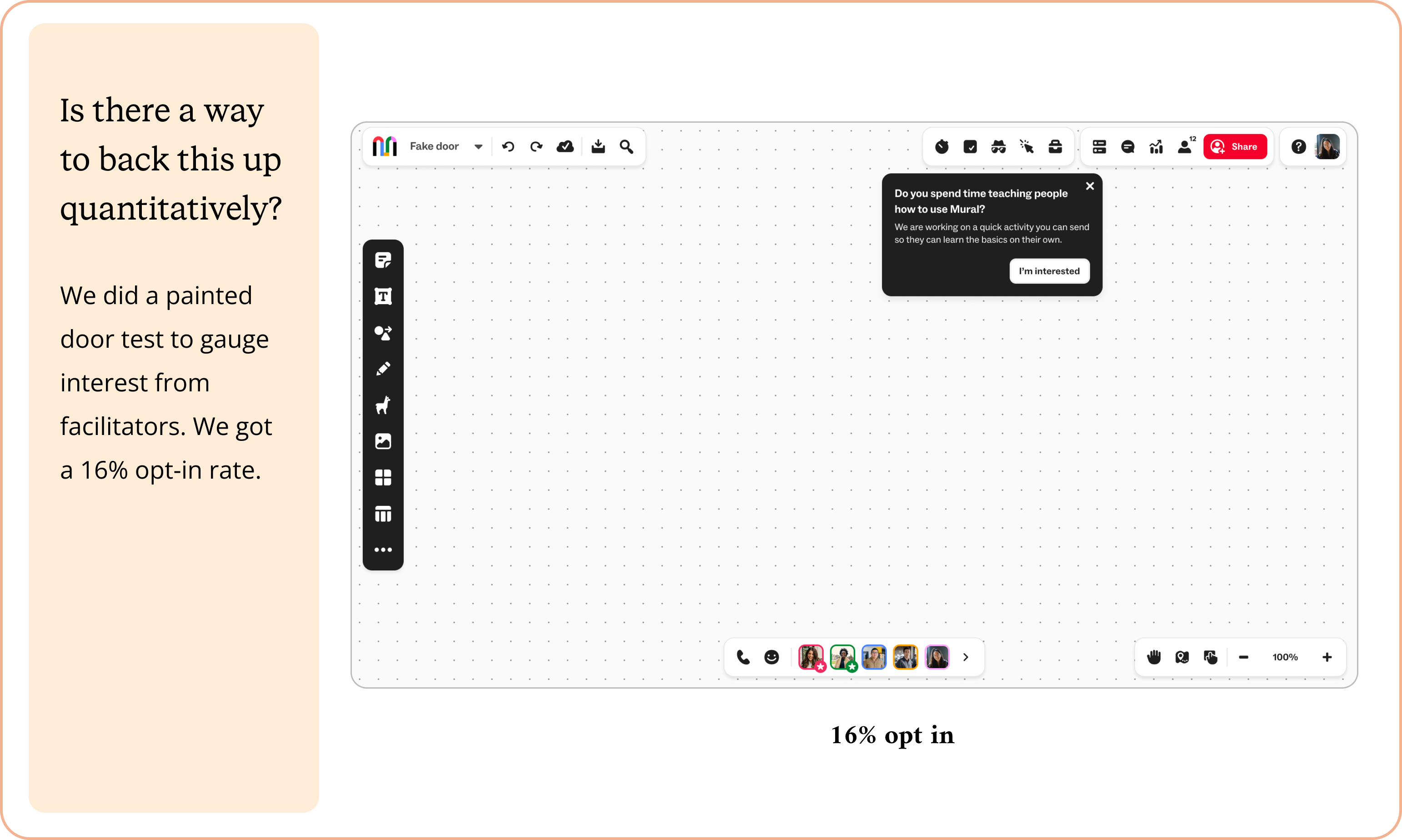
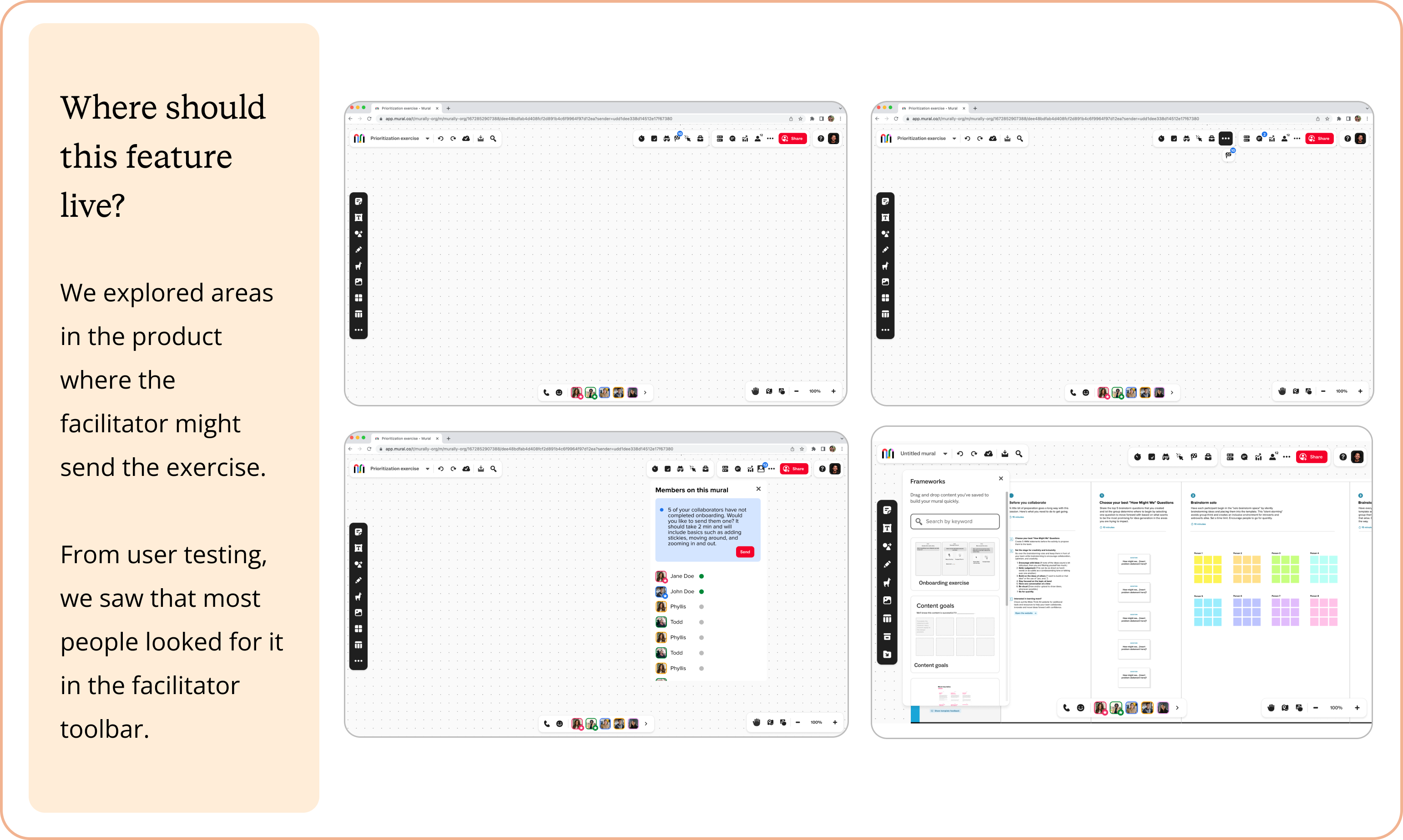
Final designs
Results
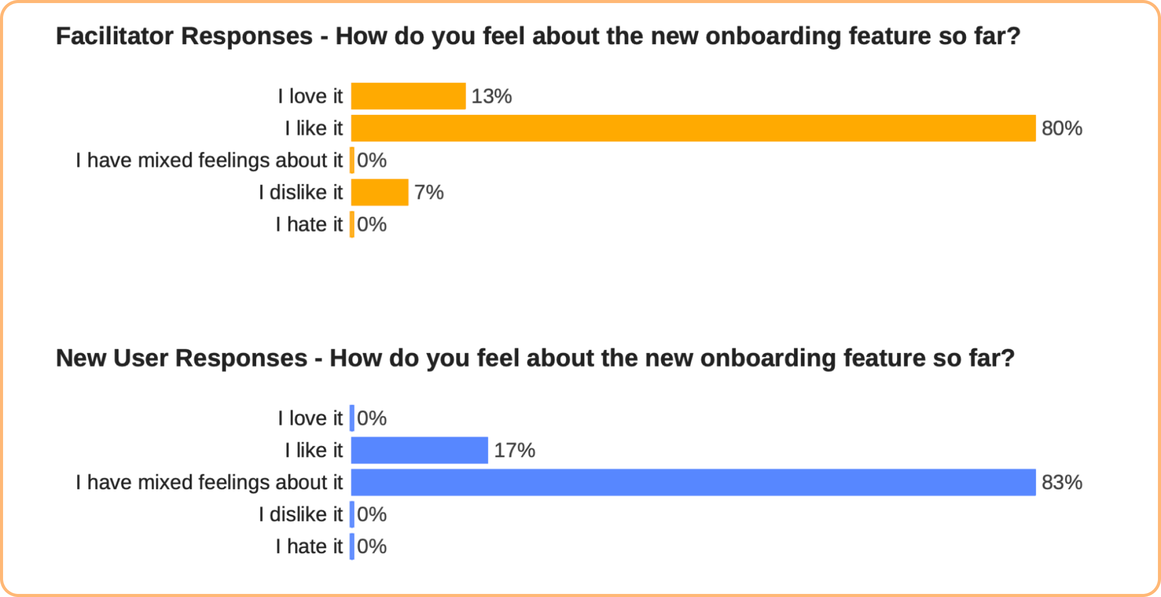
We launched to a beta group of facilitators. I left before the experiment was fully measured but we had some early quantitative data based on some surveys the Research team sent out.
Learnings
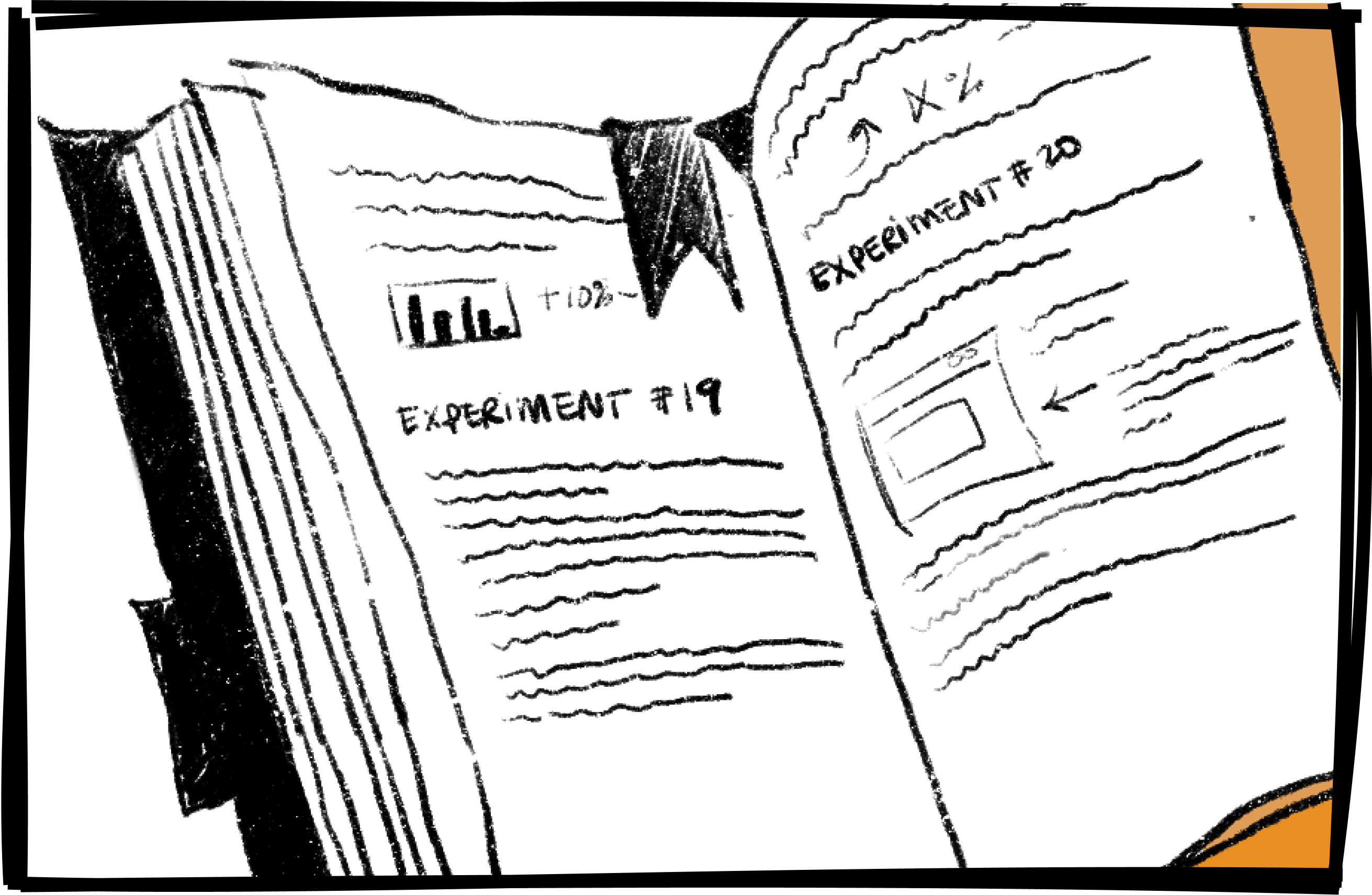
After a year of experimentation, we had mixed success from a quantitative perspective. From a qualitative perspective, we were able to synthesize our results and understand what our users were likely/unlikely to do and what made an effective onboarding for them.
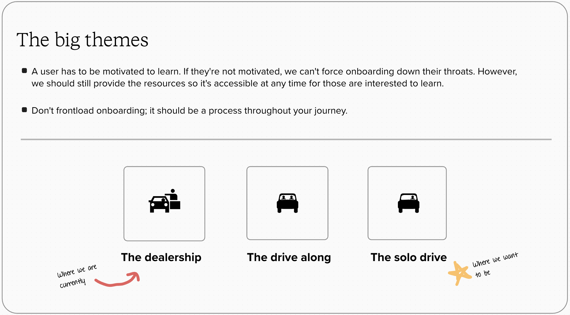
Some themes that we wanted to carry on going forward were:
• Get people to feel like they're in the product they signed up for as quickly as possible.
• Account for different peoples' motivation levels. This being a work tool, many users who were invited to use it did not want to learn a new tool. However, people who actively went looking for it are likely to have higher motivation to do so.
• Utilize onboarding in different parts of the user journey. It's not a one-and-done.
So what does this mean for our next steps? I started working on a bluesky visiontype to determine what our next set of experiments could be. I also realized that as a result of our many experiments, we had numerous onboarding flows that could be condensed into fewer ones to save design and engineering effort going forward.
Bluesky thinking
Using the learnings from above, I started working on ideas that expanded past the initial onboarding.
Make onboarding a consistent option during the initial interactions with Mural. Provide suggestions, context clues, and some gamefication.
Demonstrate lesser known features that add some delight or spark some creativity. It's a work tool, but adding image reactions was one of our users' favorite things to do.
Use AI to make suggestions based off of common words or themes. Everyone making a mural for a brainstorming session is likely to use the similar structures so the user doesn't have to start from scratch.
More case studies

Managing layouts for ML models
Creating personas
Shopping cart Conversion
Extracting complex tables with ML
A year of growth experiments