Shopping Bag Conversion
We revamped an area that is often overlooked in e-commerce: the shopping bag. Through competitive research, user testing, and utilizing best-in-practice articles, we were able to take a phased approach that lead to a 2% increase in conversion.
Team: Design Lead (me) • Product Manager • 2 Engineers
Project Background 
As a growing e-commerce company, we faced a couple of alarming data points in the Checkout process:
- 87% of our customers abandoned carts
- The Shopping Cart to Checkout flow has the largest year to year drop in the funnel compared to other parts of our website (+73% to the previous year)
While these could be caused by multiple reasons across the site, our focus as part of the Purchase Squad was the end of the funnel, the Shopping Cart and Checkout. This case study focuses on Shopping Cart.
Observing the Shopping Cart, it was clear that it had turned into a Frankenstein monster of bits and pieces of individual information, bad information architecture, and an inconsistent design system.
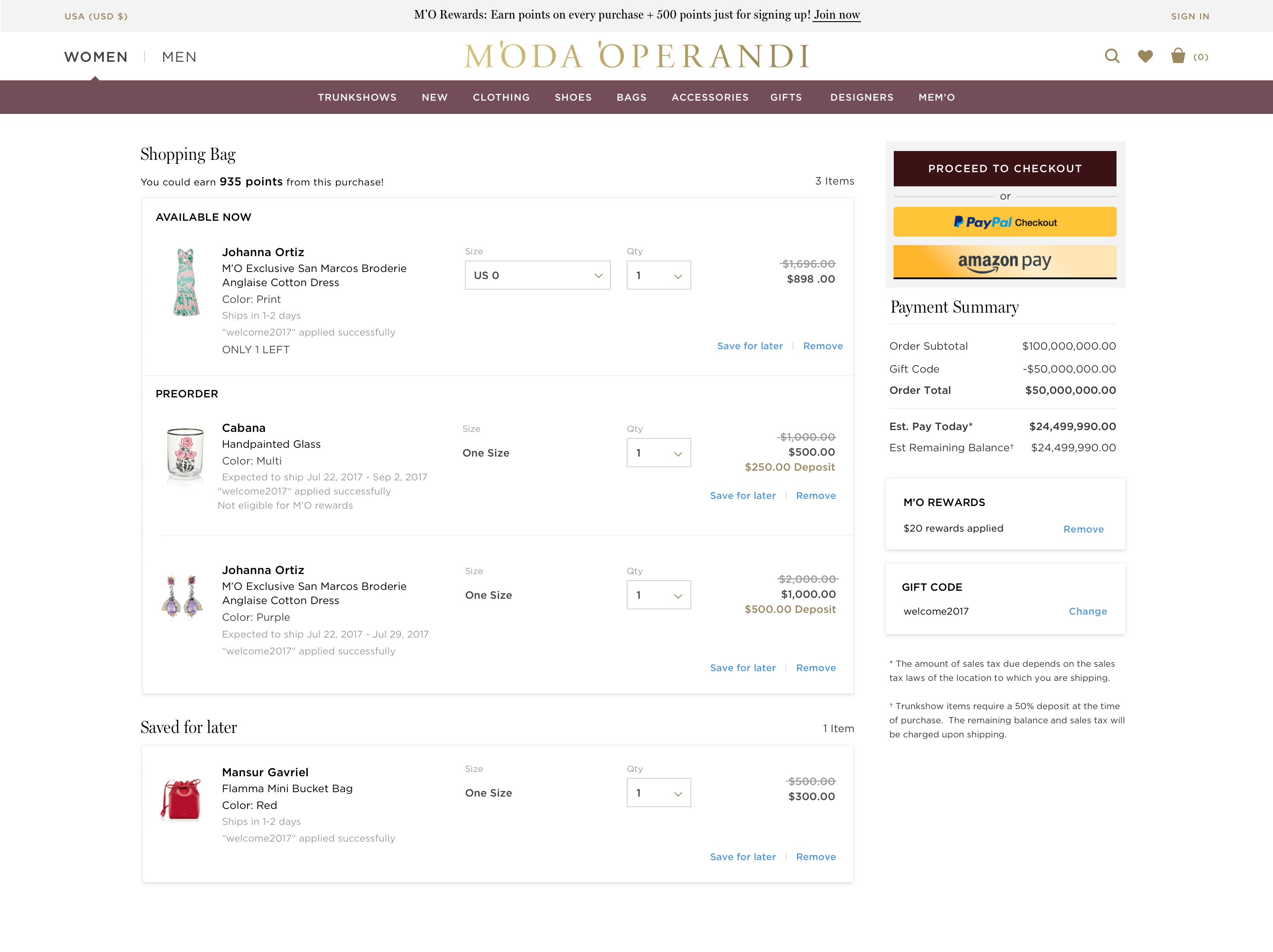
Our old Shopping Cart page
The Research 🔍
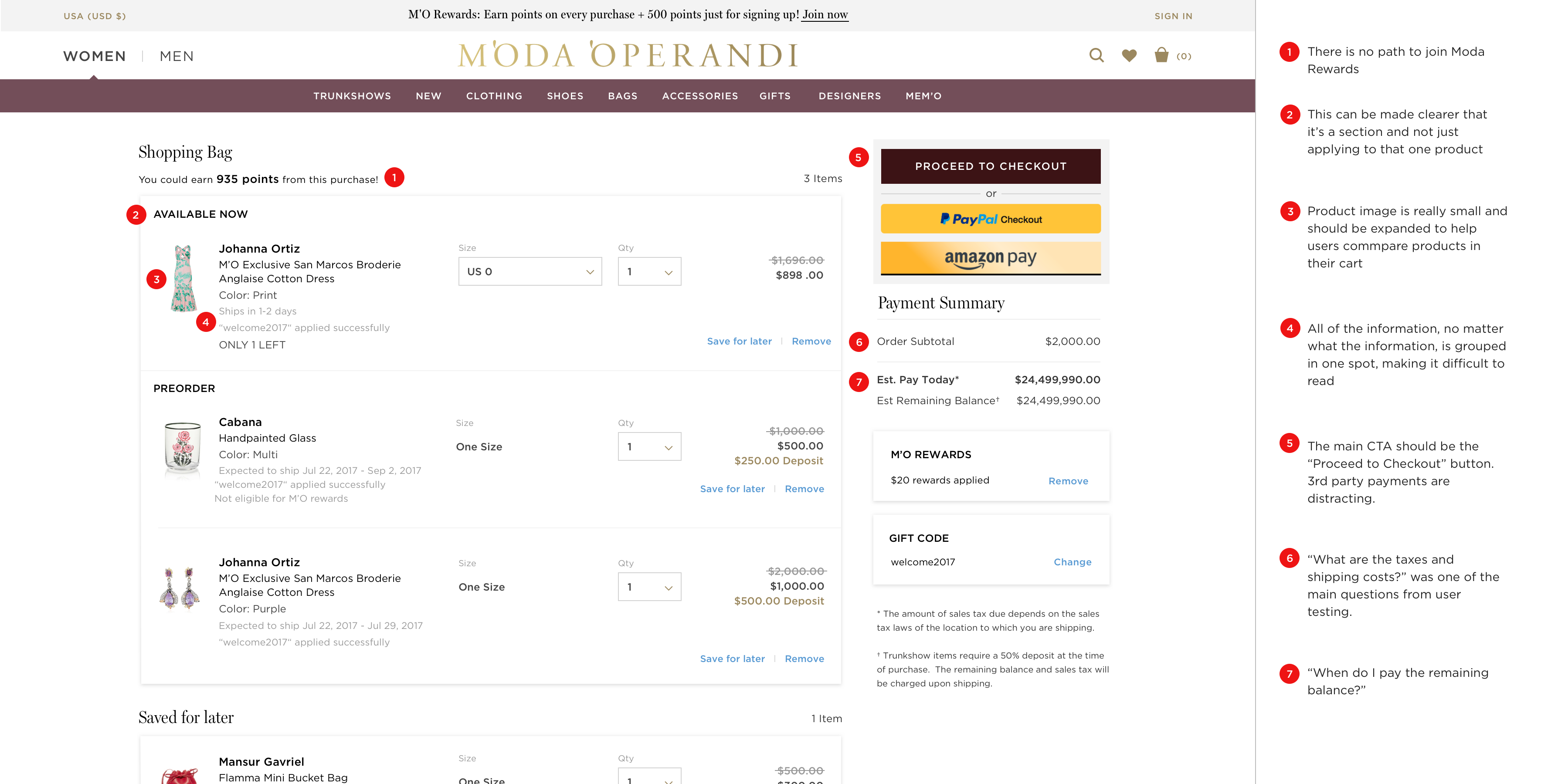
One problem that we had right off the bat was that we only had high-level quantitative data and no specifics. So we needed a bit of the qualitative data to help form our problem statements. I conducted a Heuristic analysis to understand the issues with our current page and researched best practices for Shopping Bag.
UX heuristic analysis of Shopping Cart 1.0
I also conducted a usability test for our current Shopping Bag to understand what pieces of information were most important and which pieces were most confusing for our user. You can see the full results of the usability testing here.
From the research, I was able to derive high-level problem hypothesis statements.
Problem Hypothesis #1:
Customers are confused by the information in the Shopping Cart which leads to them abandoning their carts
Problem Hypothesis #2:
Customers aren't sold on the purchase and are just “window shopping”
Step One: IA and UI cleanup 🚿
(Problem #1)
The first step I wanted to take was to rework the information hierarchy (point #4 on the Heuristic Analysis above). Currently, almost all of the product information was in one column.
I wanted to arrange certain pieces of information so it was directly related to another piece of information. For example, the "Only 1 left" only applied to that size, not the entire product, so that should belong with the sizing information.
There were also a lot of inconsistencies in the design elements. Sizes, colors, and spacing were a little all over the place. The design team was currently working on scaling everything back to grayscale in preparation for a branding agency visual revamp, so I did the same for color. I also established a standard padding system based on an adjusted version of the Fibonacci sequence.
I didn't touch the Payment Summary for this step because it would need a bigger dev lift.
The result for this first step was a cleaner UI and more comprehensive information breakdown.
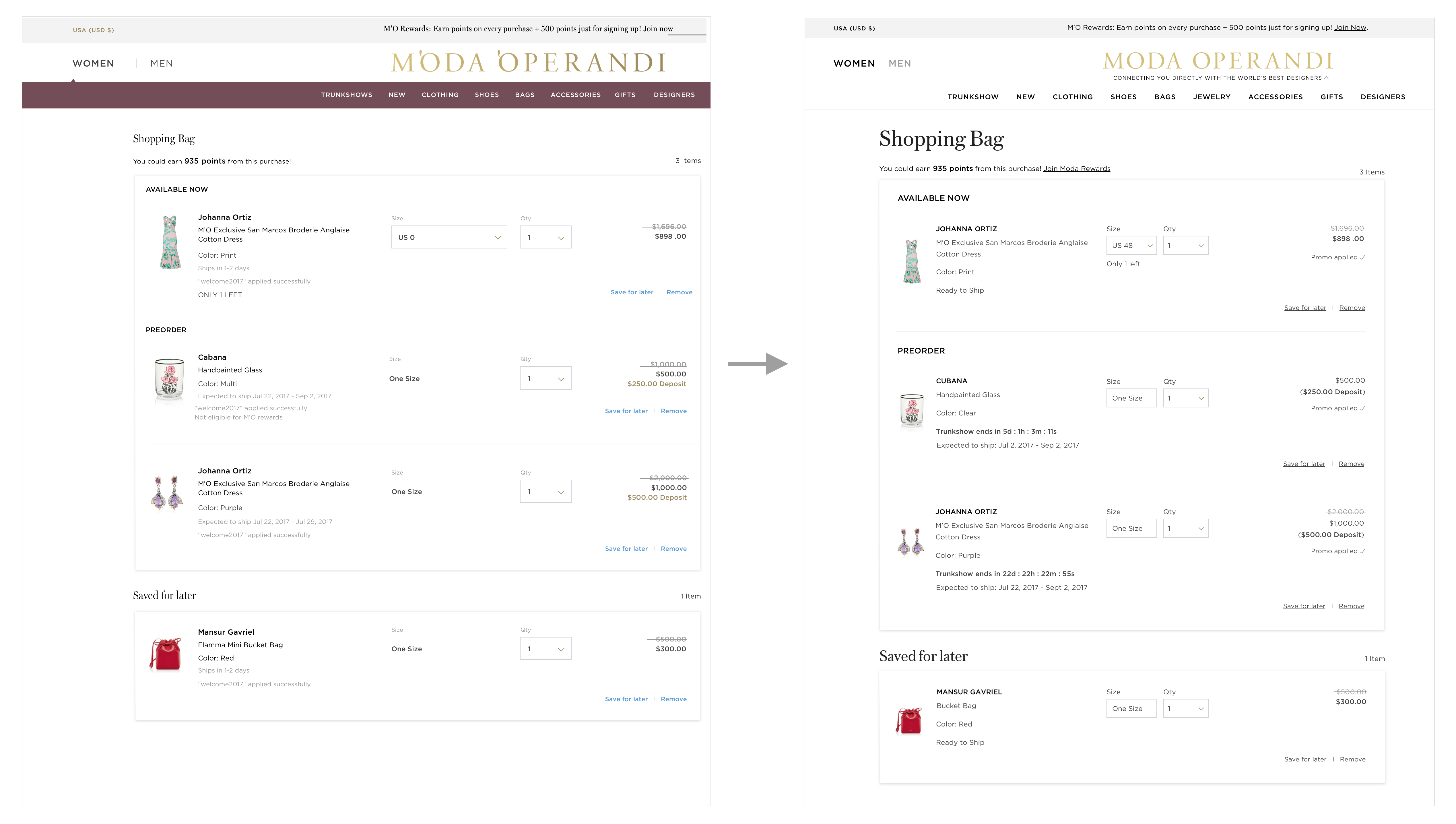
Shopping Cart v1.0 --> Shopping Cart v1.5
Step 2: Payment Summary 💵
(Problem #1)
Through the user testing sessions, it was clear that the most confusing parts were in the Payment Summary. The most commonly asked questions were:
"When would the remaining deposit have to be paid?"
"I want to see the shipping and taxes upfront. Considering the dollar amount of this purchase it's going to be a significant amount of taxes"
While the users were able to find the answers to these questions on the page, there was a lot of bouncing around on the page, which made it really important for me to contextualize the question with the piece of information they were looking for.
A common user path on this page when they were unfamiliar with our Trunkshow model
So based on the user testing sessions and best practices, I had a couple of goals that would hopefully help solve Problem Hypothesis #1:
- Clearly communicate the Payment Summary
- Explain any unfamiliar piece of information
- Make Checkout button the most prominent CTA
- Maintain design consistency to the rest of the site (following the system established in the previous step)
Following these goals, I designed a new Payment Summary.
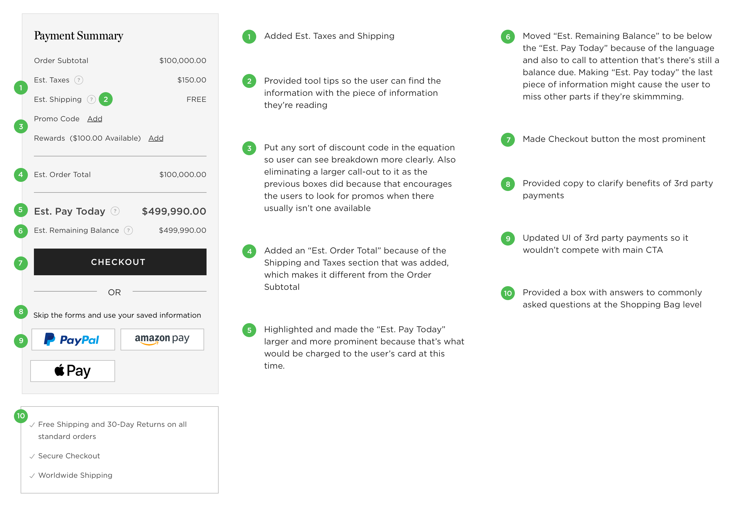
Changes made to the Payment Summary
Step 3: Further Visual Updates 🎨
(Problem #2)
The Shopping Bag is often a place people store items while shopping. They can also use this as a comparison tool to either similar items in their bag or to items on other sites. Neither of these is huge indicators to purchase, so the goal for this step was to encourage the users as much as possible to purchase.
The main design decision here involved UI changes of the product image and visual cleanups that weren't addressed in Step One. My hypothesis of the most effective factor was increasing the image sizes 3x to what they were before, thereby giving the users a better visual and a more effective selling point.
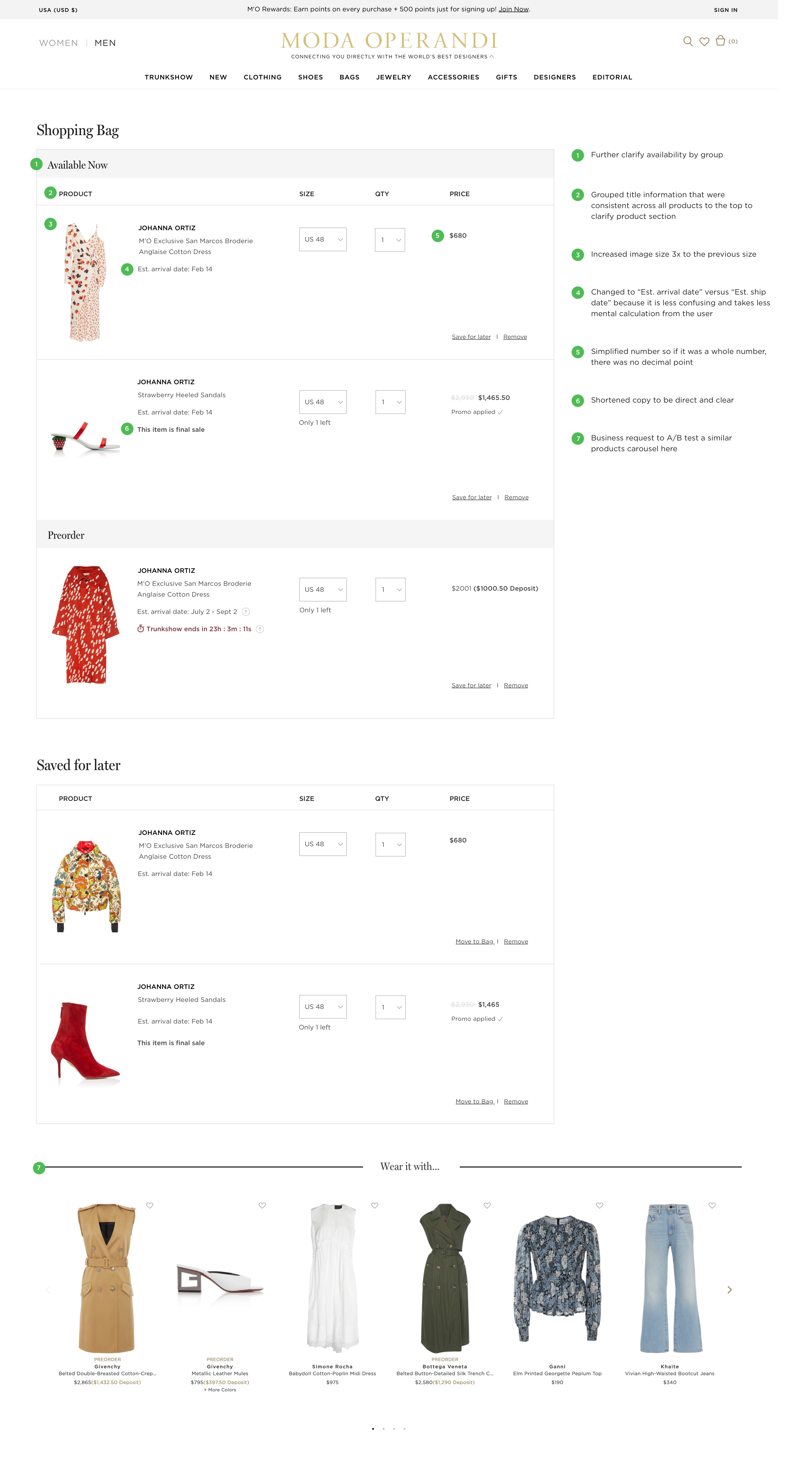
Spec doc of changes made from v1.5 to v2.0
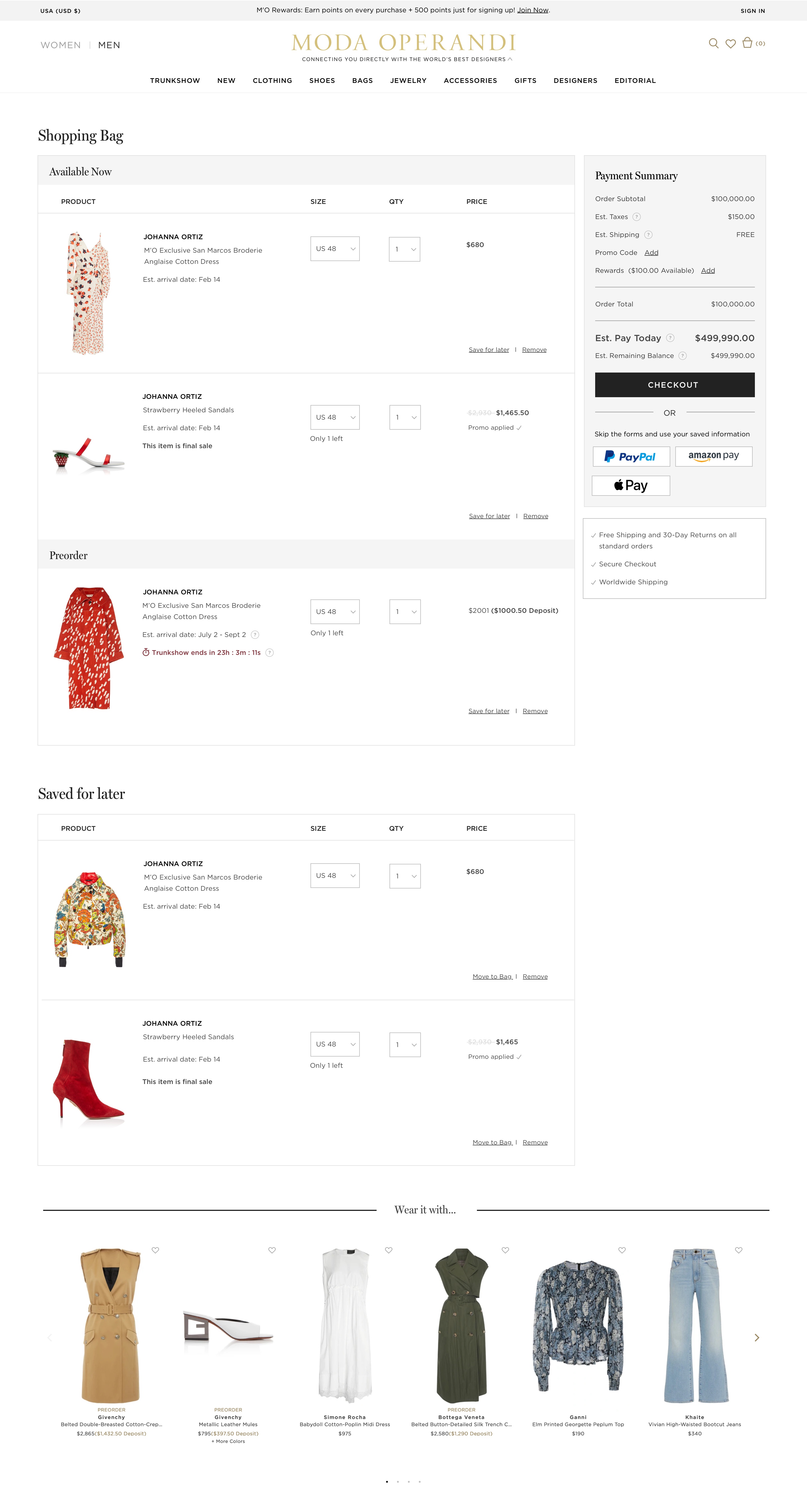
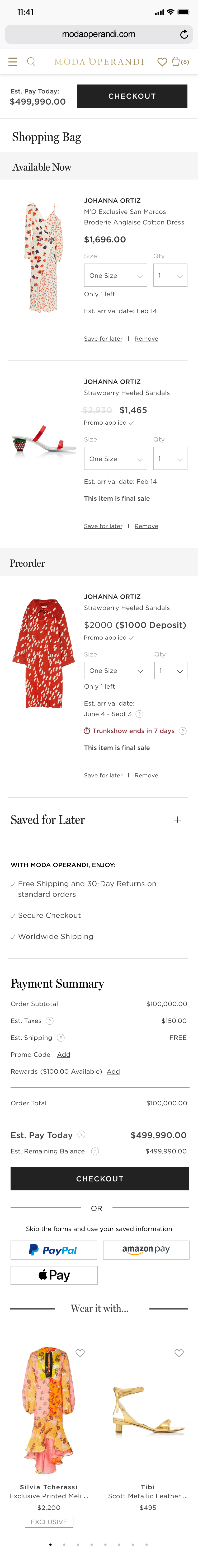
The Final Result 🦋
Additional Testing 🧪
One of our main goals for rebuilding Shopping Bag was to make sure everything was tagged properly so we could track user behavior quantitatively going forward. There were many design decisions made from assumptions and we'd like to address that in the future.
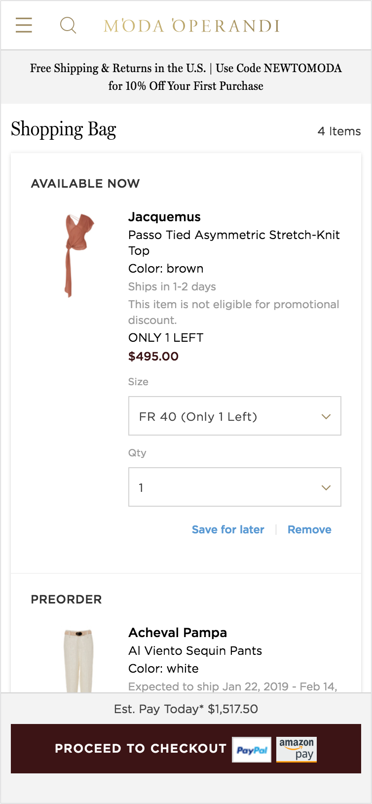
We ran a user testing session on the new mobile design and while the results still showed confusion on aspects of the Payment Summary, it gave us good feedback on what needs to be broken down even more on the Shopping Bag page but also information that needs to be across the site to educate the user on our unique business model.
More case studies

Managing layouts for ML models
Creating personas
Shopping cart Conversion
Extracting complex tables with ML
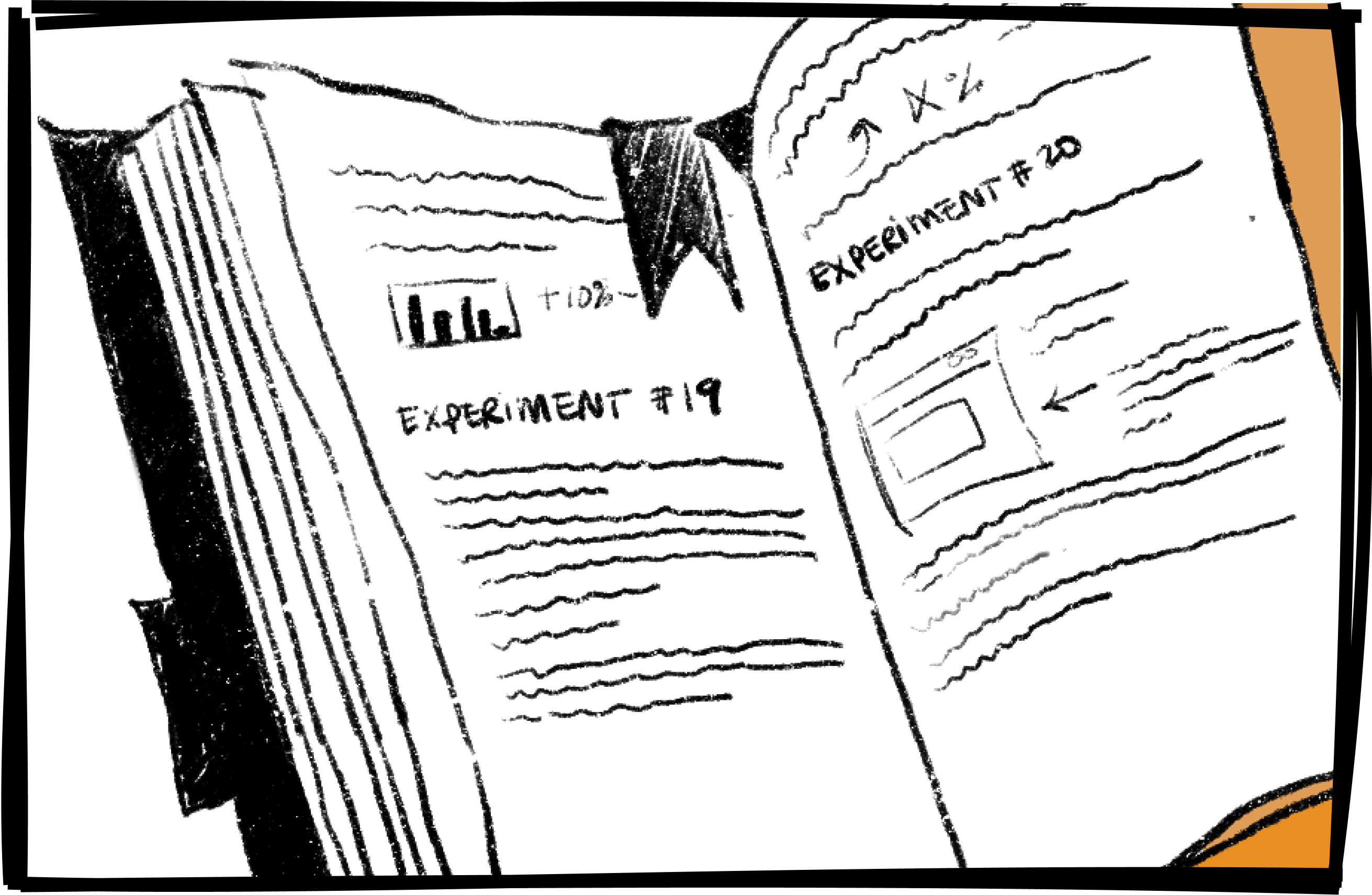
A year of growth experiments