Managing layouts for machine learning models
We redesigned a key part of the Hyperscience experience to help users decrease the amount of manual work and increase the amount of documents they were able to process. We helped maintain a $12MM contract with one of our largest customers while addressing a long-standing user need.
Team: Product Designer (me) • Tech Lead • Product Manager • Developers (6) • QA (2)
Stakeholders: Customer Experience team
What does Hyperscience do? 
Clients useHyperscience to extract information they receive from their customers in a physical format, and put it into a digital format. They can then process that information easily, quickly, and flexibly. Let's take an example of a W-2 tax form, a document that many people still fill out on paper. They then give it to their HR rep, who manually fills in more information so that your paycheck and taxes are processed correctly. That information is now trapped on paper, and has to be re-digitized before you can do anything useful with it.
Now imagine this effect at a company, perhaps an insurance company, with a massive volume of paper documents. They receive thousands of documents per day and then have to manually process it within a set timeline so people can get what they're asking for on time. Hassle x10,000 becomes a profitability concern.
Hyperscience helps our customers automate this process by using Machine Learning (ML) technology.
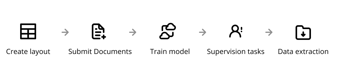
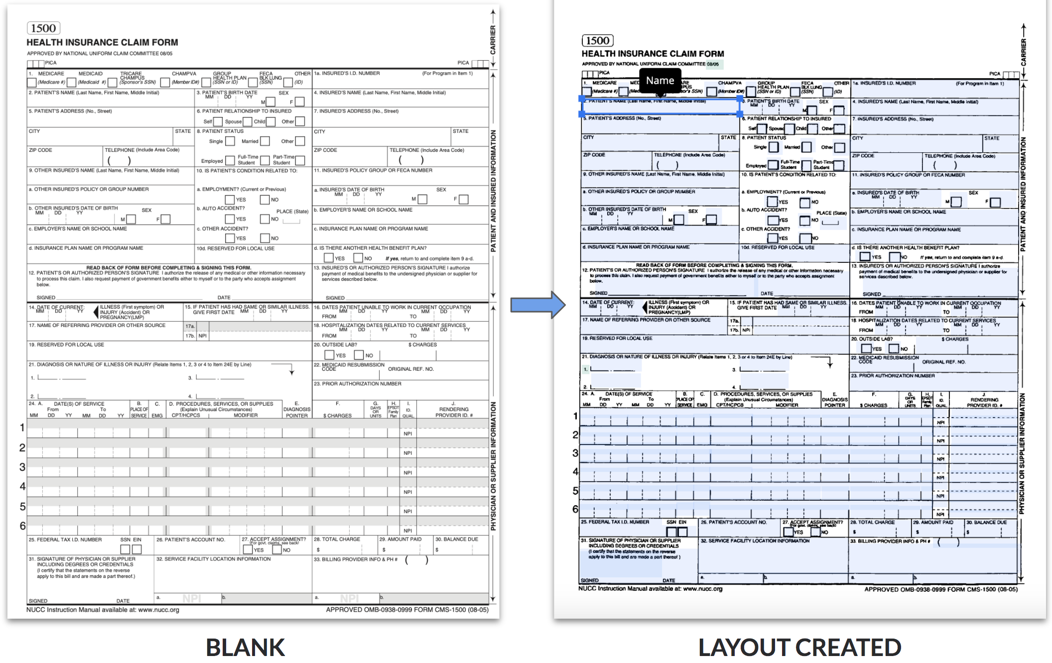
To start training the ML model, the user must create a layout to define the fields and field details they want to extract. When working with structured documents, users draw bounding boxes on the document and indicate what information is associated with each box. Since all structured documents look the same, the user should only have to do this once. (Our semi-structured models, in which the ML algorithms detect similar information from varying layouts, are a story for another day).
Project Background 
The layout creation process in Hyperscience was quite old and minor updates hadn’t grown with our customer's use cases or pains. As a result, they ran into problems when their paperwork became complex — which seems to be an inherent property of paperwork
Problems
Problem #1: As a layout owner, it's frustrating that I need to create multiple layouts for one type of document
While in theory the user could just create one layout for each structured document, the reality was that forms often change minutely between years. For example, a Dental Claim from 2010 had two checkboxes for gender while a Dental Claim in 2011 added an additional third box, and everything else would be the same. Our customers were forced to create a new layout each time, which was time consuming.
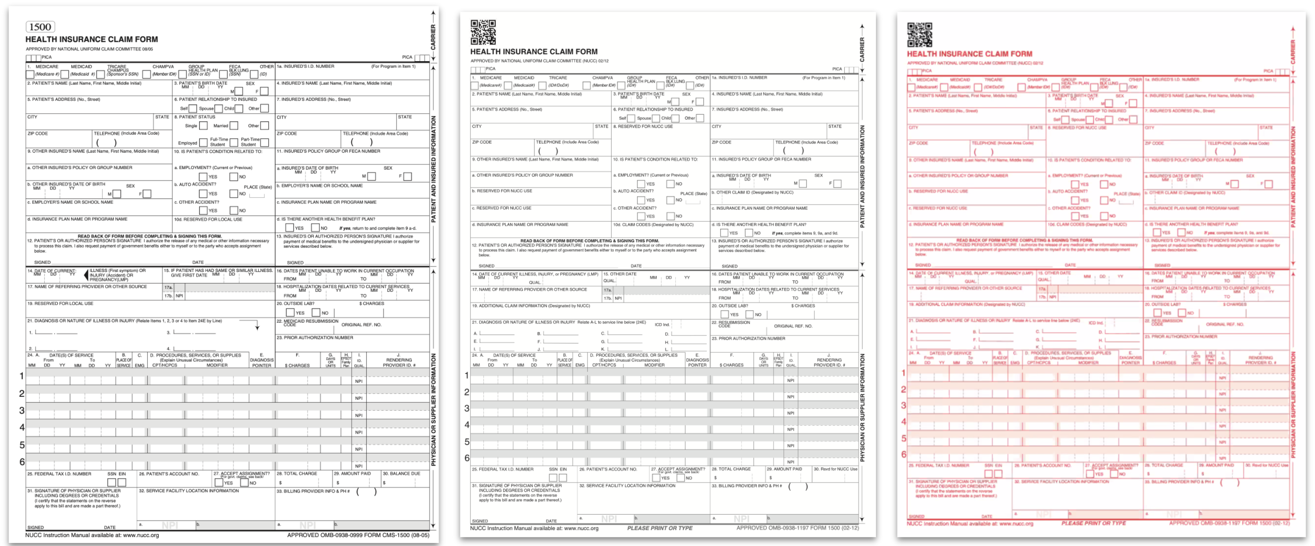
A client would have to create a new layout for each of these forms because of slight image differences
Problem #2: As a product owner, I have multiple lines of business that require slight customizations in their output
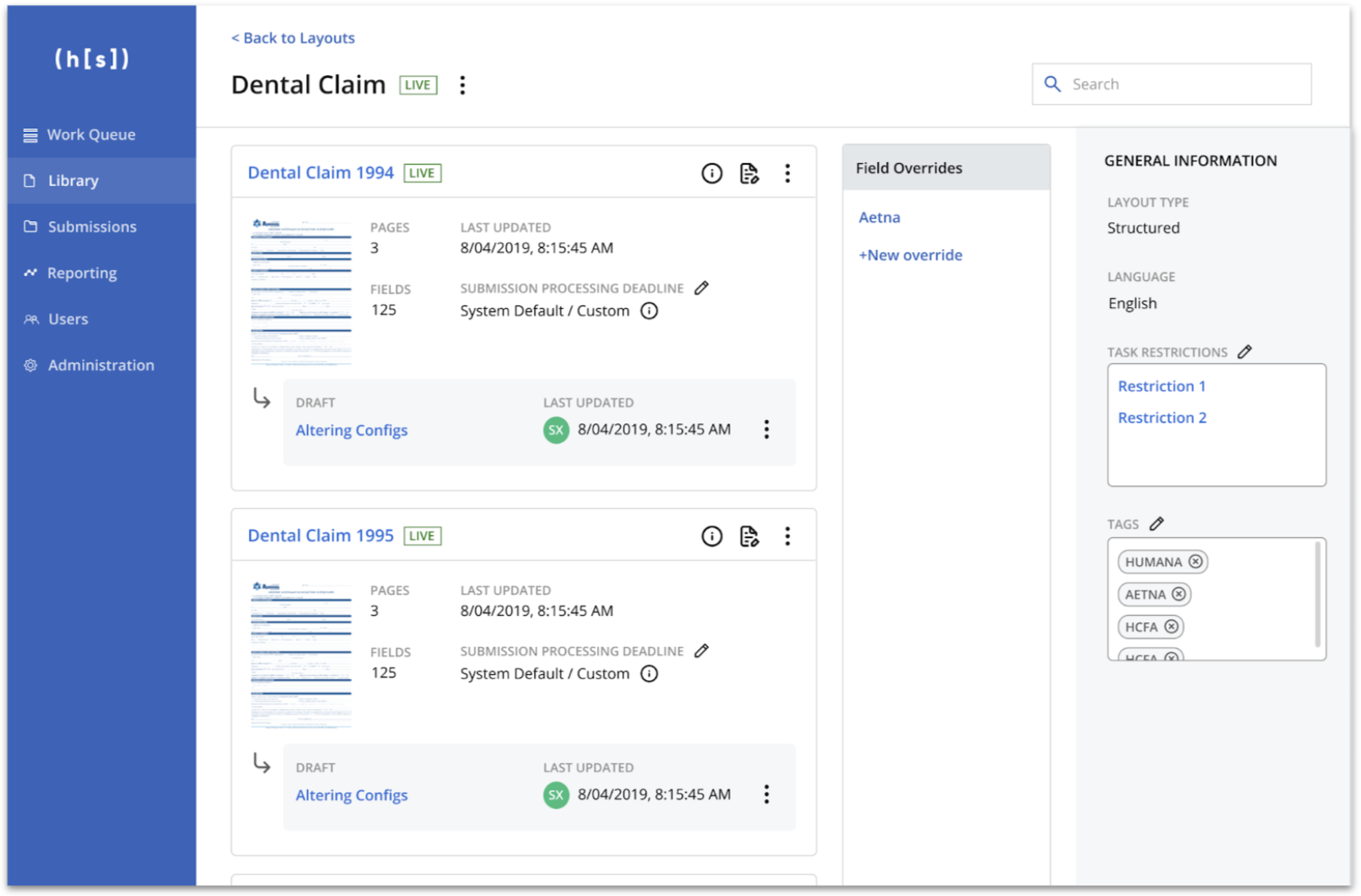
Some of our customers have their own clients and each client requests slightly different information, which requires slightly different field extractions. For example, Aetna might want the insured person's ID name while Humana might not. For each of these use cases, our clients created a new layout. This would have to be repeated every time there was a change required to the layout.
Multiple levels of variations has led to an unmanageable number of layouts
Things to Consider 
Being an enterprise software, we had to make sure to preserve any existing functionality. Any time we've removed something in the past, we often found out later that there was at least one customer who used it (and it was somehow their most important feature).
Futhermore, these problems stemmed from a high-profile customer. We had to make sure we were solving the right problem but also had to make sure our customer felt heard throughout the process.
Lastly, we had to make sure that customers who didn't need this feature still had a seamless UX.
Solutions 
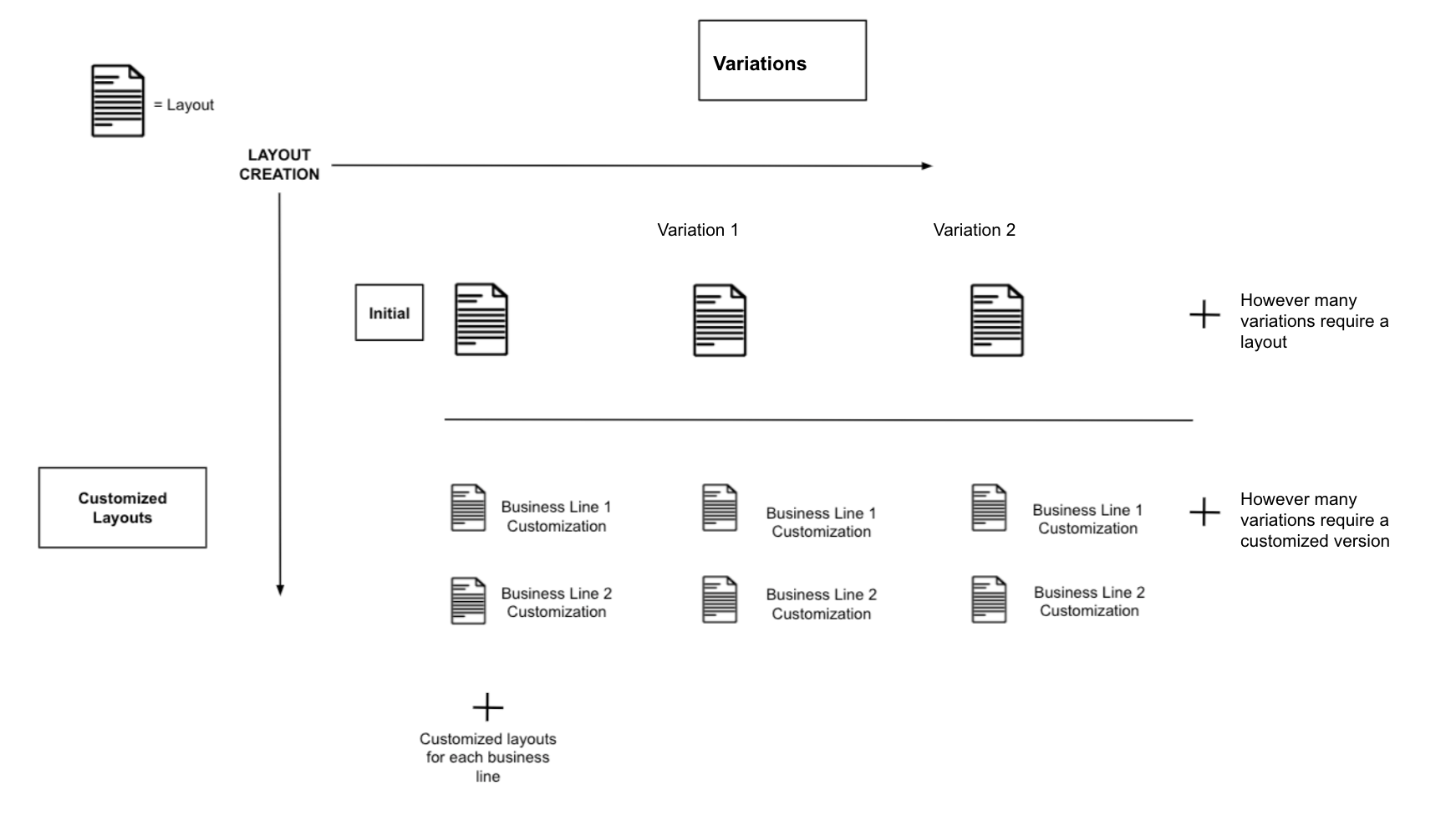
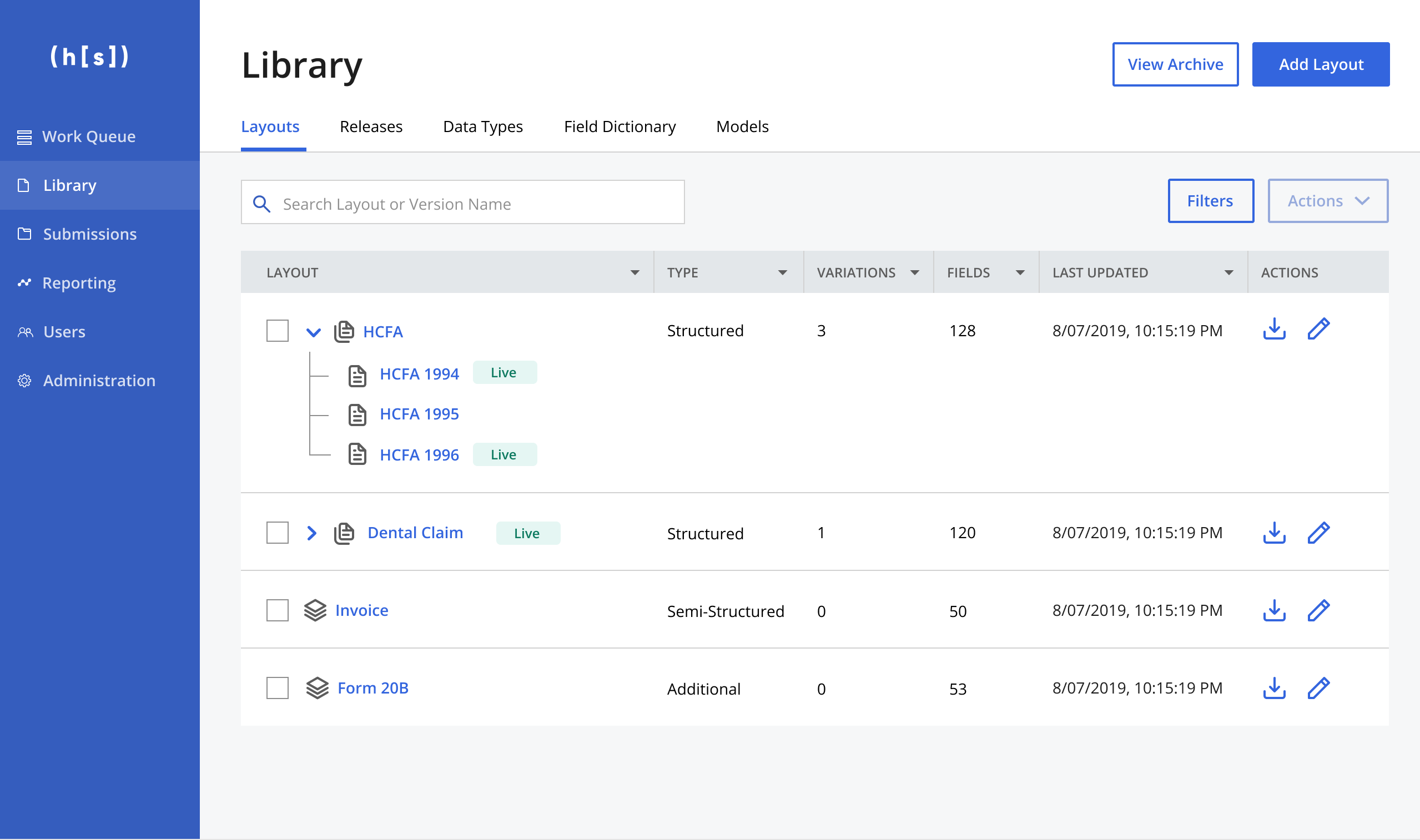
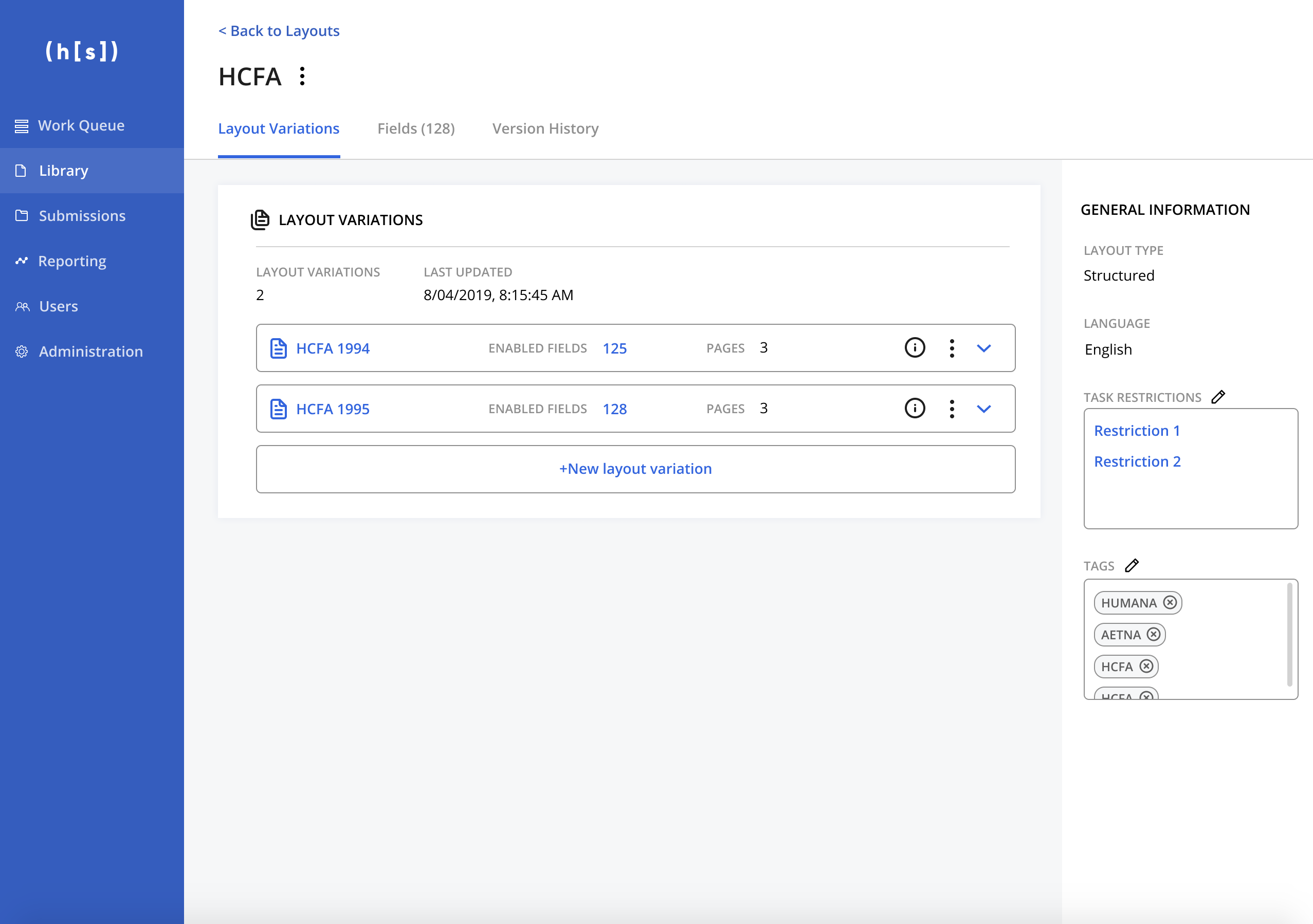
#1: Layout Variations
We decided that a layout could include a group of variations on that layout. So, for example, instead of creating a single layout for forms HCFA 1994 and HCFA 1995, you could have a group that is titled HCFA with the layout variations of HCFA 1994 and 1995 under it. These layouts would be tied together via a shared field list. We would decrease user effort by allowing them to create new variations by drawing on the existing shared field list or applying a template from a previous variation. Hopefully this would speed up the process of creating a similar layout.
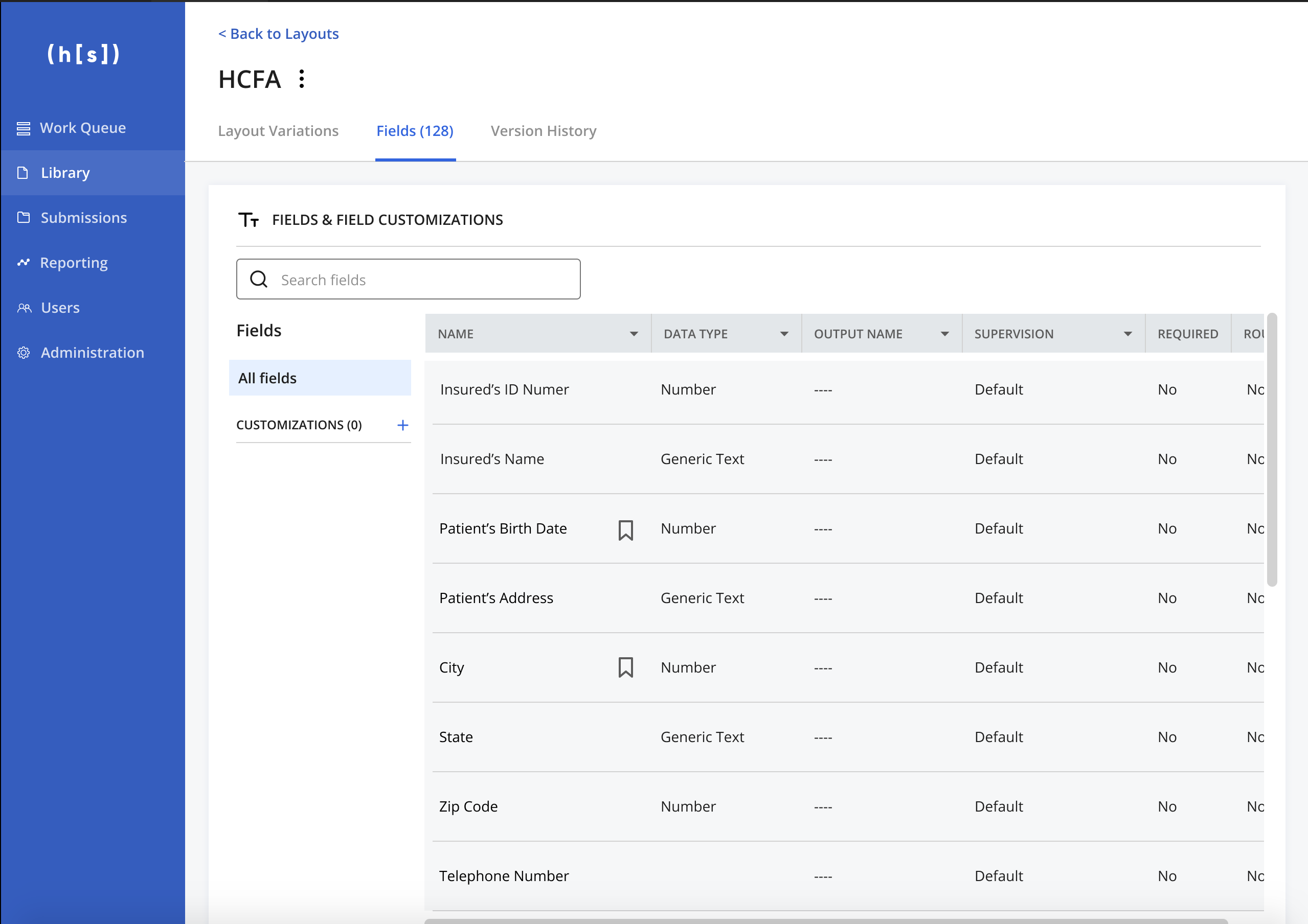
#2: Field Customizations
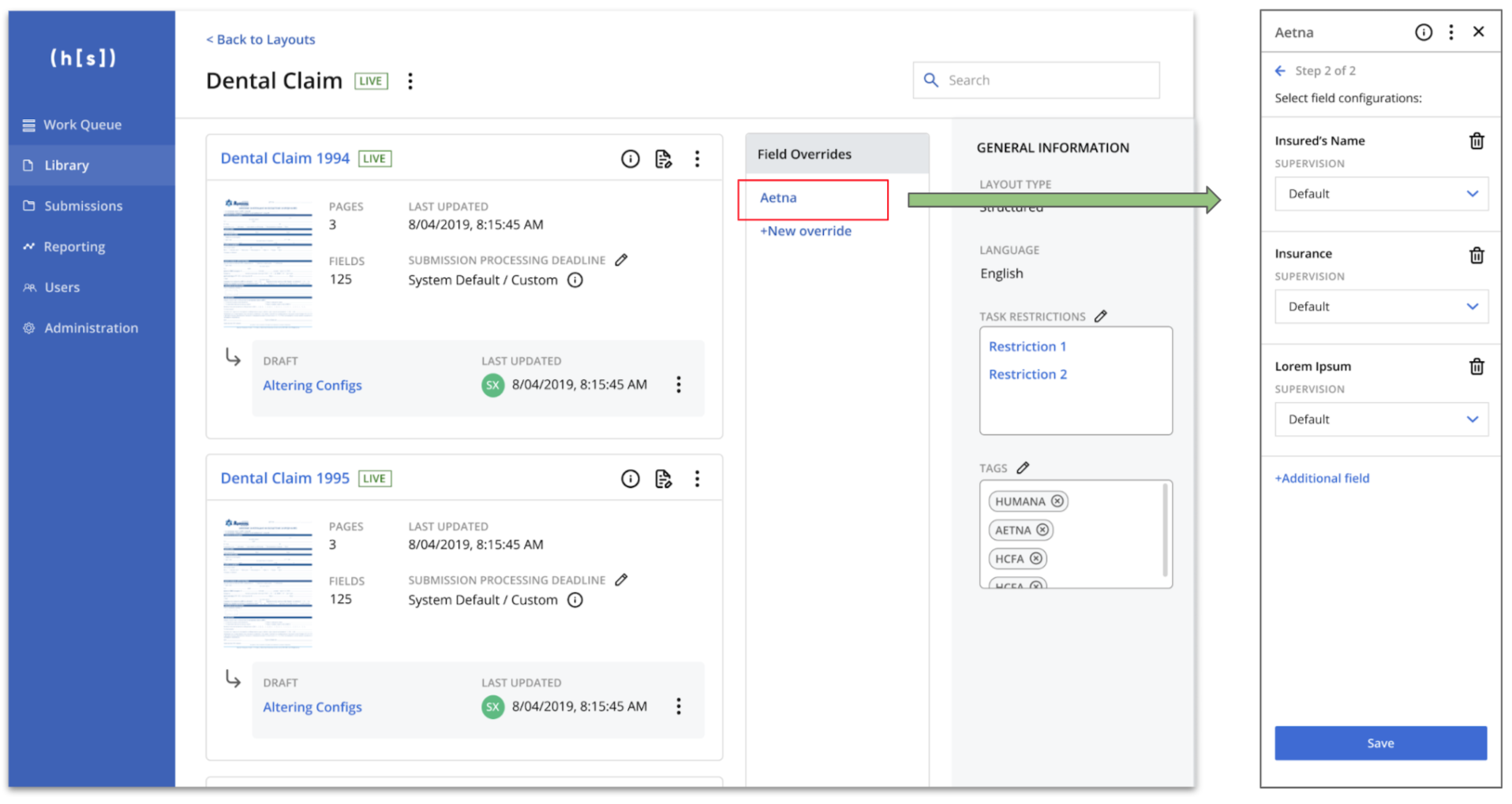
Since the extracted fields and field properties required for our customer's various clients were all the same, we decided to allow the user to make overrides of the shared field list. For example, if Aetna needed the field “Application date” to be formatted as MMDDYY for their downstream systems while Humana needed the same field to be formatted as MMDDYYYY, all the different lines of businesses had to do was adjust a setting rather than creating an entirely new layout.
#3: Versioning
As we ideated, we realized we couldn't get rid of the versioning format completely because our users relied on it to go back to previous versions after A/B testing their own layouts. We decided to allow users to save previous versions, without requiring them to create a new version for every small change. It would essentially function as a living document with a hard version save every time changes were applied.
TL;DR
We made the layout a larger entity so that instead of managing multiple layouts, you would be managing one. This would hopefully allow our customers to quickly create new layout variations and scale faster.
Testing and Iteration 
As we iterated on our solutions, we made a lot of changes to the existing framework so we tested both internally and with our users to make sure it could still make sense, especially to existing users who wouldn't be needing these new features.
There were a lot of specifics that came out of our 3 rounds of user testing, but there were a couple of big areas that we continuously focused on:
1. Users were unsure of what changes affected what when they applied changes
The field customization process was not clear. The users expected to see the entire field list rather than just the fields that were overridden.
The Final Result 
Here are what some parts of the final designs looked like! It was truly a team effort.
Old designs
New designs
Outcome 🏆
We were able to save a major client and build trust with them. They were very happy with the feature and being involved during design and development, helping Hyperscience retain a $12MM contract.
Retrospective🪞
As with any project, there's always room for improvement!
Our biggest problem was definitely the scope of this project. We approached this project as more 'bluesky' and ended up with something that was the equivalent of probably 5+ projects rolled into one. So while we did solve the problems we had initially set out to solve, the project extended the timeline and ate up more resources than were originally allocated. For my next project, what I've done is push for smaller and more iterative scope.
More case studies


Managing layouts for ML models
Creating personas
Shopping cart Conversion
Extracting complex tables with ML
A year of growth experiments